Customizing your QR code
Shapes & Logo Embedding
Beyond color, you can change the shape of the dots and corners, round the overall code, and embed your own logo in the center.
Dot and corner styles
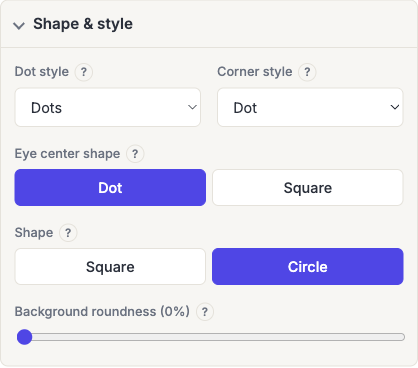
Dot style (Square, Dots, Rounded, Classy, Classy rounded, Extra rounded) and Corner style (Square, Dot, Extra rounded) can be set independently.
These are cosmetic. They change how each module is drawn, not the data underneath. The one thing to watch is that the more decorative dot styles leave slightly more space between modules, which costs you a little contrast at small printed sizes. If a code is going somewhere physically small, plain Square is the safest choice.
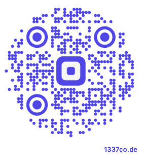
The overall Shape toggle also lets you fit the whole code inside a Circle instead of the default Square. The pattern shrinks slightly to stay inside the circle, so the modules end up smaller at the same overall width. It can be a touch harder to scan from a distance.
Embedding a logo
On a business account, a logo can belong to the whole team rather than to you, see Team Logos.
Check Import a custom logo to reveal the logo options. There are up to four Source choices:
- Upload: an image file from this device.
- Link: an image already on the web, by URL.
- Built-in: one of the symbols we draw and ship. See Built-in symbols below.
- Saved. A logo stored on your account, and on a business account your team's logos too. This appears only once you have at least one; see Team Logos.
Whichever you choose, you can then adjust the logo's size, remove its background, or recolor it to a solid color.
Every code this generator makes is already built at error correction level H: the highest of the four levels, whether or not it has a logo. That's what makes a logo possible at all: level H is designed so a code still decodes with a substantial share of it unreadable. Nothing extra is switched on when you add a logo. You're spending a margin that was always there.
Which is the thing to understand about logos generally: a logo is deliberate damage. It doesn't sit on top of the code in some separate layer; it destroys the modules underneath it, and the decoder reconstructs them from the redundancy that level H built in. Spend too much of that margin and there's nothing left to absorb the ordinary damage of the real world: print registration, a scuffed sticker, bad lighting, an awkward angle.
How big is too big
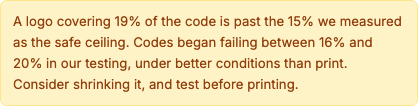
Keep the logo at or below 15% of the code's area. The slider goes to 20%, and above 15% the generator will warn you.
That's stricter than the 20–30% figure most QR guides quote, and we didn't take it on faith. We swept logo coverage against a real barcode detector across several QR versions. Codes began failing consistently between 16% and 20% of the area, under conditions far kinder than any print job: a clean digital render, a perfect quiet zone, no camera noise, no angle, no wear.
The reason the common figure is wrong is worth knowing. "Level H recovers about 30%" is a budget measured over codewords, and it assumes damage is scattered across the code. A centered logo is the opposite of scattered. It wipes out whole blocks at once, and a block that's entirely gone can't be reconstructed no matter how much budget remains elsewhere.
Because area grows with the square of width, the slider's percentages move faster than they feel: 15% of the area is about 38% of the code's width, and nudging that width up to 45% takes you to 20% coverage. The level that failed in testing. See the full measurements and the decode proofs.
The two warnings you might see
The generator watches for two different failure modes, and they're genuinely separate problems:
- Coverage. The logo is over 15% of the area. This applies regardless of how much data the code holds.
- Density. The payload is long enough that the code needs a fine grid, so even a modest logo destroys more of a single block than that block can repair. A long vCard or a Wi-Fi password with a complex passphrase will trigger this well below 15%.
If you hit the density warning, shrinking the logo is only one option, shortening the content works just as well and often better. A dynamic QR code is the cleanest fix, since it encodes a short redirect link no matter how long the real destination is.
Placement and shape of the logo itself
The logo is always centered, which is deliberate. The three large corner squares (the finder patterns) are what a scanner uses to locate the code at all, and covering any part of one breaks it instantly no matter how small the logo is. Center is the only region where the damage is recoverable.
Practical notes:
- A square or circular logo works better than a wide one. A wide logo at the same area reaches further toward the timing patterns running between the finders.
- Use "Remove background" on a logo with a transparent or white field so it doesn't punch a larger opaque block than the artwork actually needs.
- Simple marks survive better than detailed ones. At the size a logo occupies on a printed code, fine detail turns to mush anyway, so a simplified version costs you nothing visually and lets you use less area.
Clear space around the logo
A second slider sets how much blank space sits between the logo and the modules around it, measured in modules rather than pixels.
That unit matters. The setting used to be a fixed number of pixels, which meant the same choice gave visibly different results depending on the code: about a fifth of a module on a short link, about a third on a dense vCard. In modules it means the same thing on every code you make.
A little clear space helps a scanner tell the logo from the pattern, especially when the logo's colors are close to the code's. It is not free: the space is cleared out of the code the same way the logo is, so it comes out of the same error-correction budget. Treat it as part of the logo's size rather than as something separate.
Built-in symbols
If you have no artwork of your own, or you want something in the middle of a code that is not a brand mark: the Built-in source offers fourteen symbols drawn for this product:
Link, Wi-Fi, Location, Email, Phone, Message, Event, Shop, Play, Photo, Help, Manual, Star and Heart.
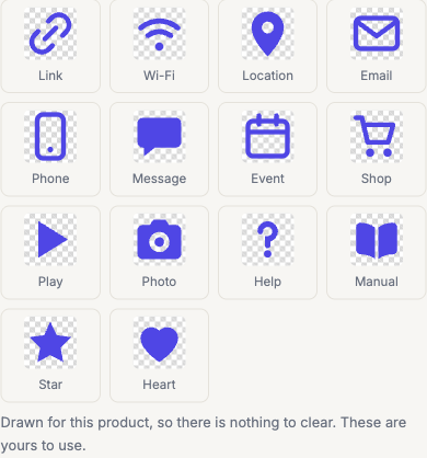
They are picked to hint at what a code does, a Wi-Fi mark on a network code, a Location pin on a map code. Which is a real usability gain on a printed sign where nothing else says what will happen when someone scans it.
Two things make them different from an uploaded image:
- There is nothing to clear. They are generic shapes drawn for this product, not an icon pack and not anyone's brand mark, so you can use them commercially without permission from anybody. An image you upload is your own responsibility, trademarks and copyright belong to whoever owns them, which is why the reminder sits right beside the upload control.
- They are generated rather than uploaded. A built-in symbol is drawn fresh at the resolution the code needs, so there is no small original to run out of detail. An uploaded image can only ever be as sharp as the file you gave us, which is the usual reason a logo looks soft on a printed code.
A built-in symbol takes the code's own color by default, so it reads as part of the design rather than as something dropped on top. The Recolor control overrides that if you want it to contrast.
They are drawn deliberately bold and simple. A logo occupies around 15% of a code's area and is often printed at a couple of centimeters, so hairline strokes and fine detail would vanish at that size. And detail that vanishes is detail that made the code harder to scan for nothing.
The same fourteen symbols are in the iPhone, iPad and Android apps, under the same Built-in source.
Frequently asked questions
Does adding a logo lower my error correction level?
No. Codes are generated at level H whether or not there's a logo, and adding one doesn't change that. What the logo does is consume the recovery margin level H provides, which is why the size ceiling matters. The level stays the same, the headroom doesn't.
Why does the generator warn me when my logo looks fine on screen?
Because a screen is the easiest possible scanning condition. A code rendered crisply on a bright display, held still, at a comfortable size, will decode with damage that would fail on a printed sticker under shop lighting at arm's length. Our own testing found the failure cliff under ideal conditions, real conditions are worse, so the warning is deliberately early. Test a physical proof before committing to a print run: see testing before printing.
Can I put a logo on any QR type?
Yes, the logo controls work with every type. But the denser types: vCard, Wi-Fi, and Event, produce a finer grid, so they hit the density warning at smaller logo sizes than a short link does. If you want a logo on a vCard, keep the vCard fields brief.
Does the circle shape make a code less reliable?
Slightly. The pattern shrinks to fit inside the circle, so at a given printed width the modules are smaller than the square version's. And module size is what determines whether a camera can resolve the code at distance. It's a fine choice for something held in the hand or viewed on screen; for a poster or a sign meant to be scanned from several feet away, use the square.
My logo made the code stop scanning. What do I change first?
Size, before anything else, drop it to 10% of the area and test again. If it still fails, the payload is likely the real problem rather than the logo; shorten the content or switch to a dynamic code. If it works at 10% but not 15%, that's the coverage cliff and you've simply found where yours sits.