Use Cases
Donation QR Codes for Nonprofits
A donation QR code carries a burden most others don't: the person scanning is about to hand over payment details, usually on impulse, often standing in a room full of people. Trust and friction matter more here than anywhere else a QR code gets used. And both are decided before anyone scans anything, by what you linked to and what the page looks like when it opens.
The short version
- Link straight to the giving form, never the homepage. The single most costly mistake in this category.
- Use a dynamic code so the same printed material serves next year's appeal too.
- Suggest amounts, and tie each one to a concrete outcome.
- Run a different code per placement so you learn which materials actually raise money.
- Branding on the landing page is a trust signal, not decoration. A generic form loses donors at the payment step.
- Complete a real test donation on a phone before printing anything.
Where the code should point
Almost every underperforming donation QR code has the same defect: it opens the organization's homepage. From there the donor has to find the navigation, choose a giving page, pick a fund, scroll to a form, and only then start giving. Each step is a place to lose someone whose intent was a few seconds old.
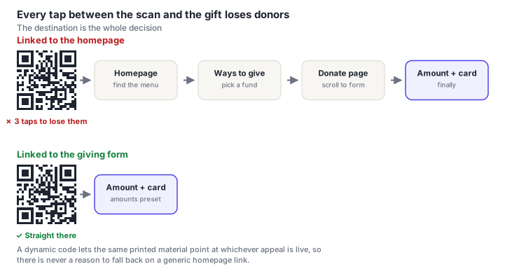
The code should open a page where entering an amount is the first thing visible without scrolling. Not a page about the campaign with a donate button below the fold. Not a fund selector. The amount field, on the first screen.
If you genuinely need to explain the appeal, put that below the form. People who want context will scroll; people who already decided shouldn't have to.
Suggested amounts, tied to outcomes
An empty amount box asks the donor to do arithmetic and guess what's appropriate. That hesitation is where a lot of gifts quietly disappear. Preset buttons remove it.
The stronger version attaches each amount to something concrete: "£25. A week of meals for one family" reads very differently from a bare £25. It turns an abstract transfer into the purchase of a specific outcome, and gives the donor a reason to pick the higher option.
- Offer three or four presets, plus "other." More than that is another decision to make.
- Make the middle option the default. Most people take it.
- Offer recurring giving as a toggle, not a separate path. A monthly donor is worth several times a one-off gift, and the moment just after scanning is the best time to ask.
- Collect gift aid or tax-receipt details after payment, not before. Anything that delays the payment step costs completions.
Trust, and where donors abandon
A donation page is asking for card details from someone who arrived via a black-and-white square on a piece of paper. That's an unusual amount of trust to ask, and the page has about two seconds to earn it.
- The landing page must obviously belong to you. Same logo, same colors, your name in the URL. A donor who lands on an unbranded payment form will hesitate, and hesitation at the payment step is abandonment.
- Show the payment processor. A recognizable provider is a trust signal for people with no other way to verify you.
- Name the beneficiary explicitly. "Your gift funds X" answers the quiet question about where money actually goes.
- Keep the URL clean and recognizable. A giving link on an unfamiliar third-party domain undercuts everything else on the page.
- Send an immediate receipt. The gap between paying and being acknowledged is where donors wonder whether it worked.
Because they appear on posters, collection tins and event signage in public places, donation codes attract sticker-over-sticker attacks, someone covers yours with a code leading to a lookalike payment page. Two habits help: print the code as part of the material rather than applying it as a separate sticker, so tampering is visible, and check unattended public codes periodically. Tell volunteers what the correct destination domain looks like so they can spot a swap. Our QR security guide covers the pattern.
One code per campaign. And per placement
Printed fundraising material has an awkward property: it outlives the campaign it was made for. Banners, table signage, programs and mailers get produced for one appeal and then sit in a cupboard, because the code on them points somewhere obsolete.
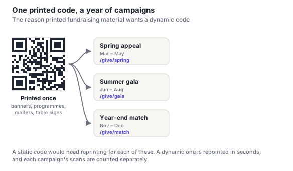
The second, less obvious win is measurement. Use a different code on each placement (one for the event table, one for the mailer, one for the program, one for the lobby banner) and you learn which materials actually raise money. Most organizations have never been able to answer that question about print, and the answer is frequently surprising.
That data also makes the internal case. "The gala program produced 140 scans and £2,300" argues for next year's print budget in a way that "we printed some programs" does not.
Placement and physical setup
Donation codes get scanned in a fairly narrow set of situations, each with its own constraint:
| Placement | Code size | What to watch |
|---|---|---|
| Event table sign | 4–6 cm | People are standing (keep it upright and unobstructed) |
| Program / order of service | 3–4 cm | Keep it clear of the fold |
| Direct mail | 2.5–3 cm | Pair with a short URL for people who won't scan |
| Lobby banner / pull-up | 15–25 cm | Chest height, not the top of the banner |
| Collection tin / donation box | 3–4 cm | Highest tamper risk (check it regularly) |
| End slide of a talk | A third of the slide | Leave it up for at least 30 seconds |
Two details matter more than they sound. Codes at eye level get scanned; codes at the top of a banner don't: people won't reach up with a phone. And a code on screen for ten seconds may as well not be there: an audience needs time to register it, get a phone out, unlock it and aim.
Error correction level Q is a sensible default for event materials, which see variable print quality and a lot of handling. If your logo goes in the code, use level H and keep it under about 15% of the area, see adding a logo to a QR code.
Before you print
Everything in the pre-print checklist applies. These are the donation-specific additions:
- Complete a real donation yourself, on a phone, on mobile data rather than office Wi-Fi. A small gift you can refund is cheap insurance against finding a broken flow after 5,000 mailers.
- Time it. Scan to receipt should be under 30 seconds. If it isn't, something in the middle is removable.
- Try it logged out, in a private window: otherwise you're testing a version of the page no donor will ever see.
- Confirm the receipt email arrives and looks like it came from you.
- Hand your phone to someone who doesn't work there and watch where they pause. That pause is your conversion problem.
Frequently asked questions
How do I make a QR code for donations?
Start with the direct URL of your giving form. The page where entering an amount is the first thing visible, not your homepage or a campaign explainer. Generate a dynamic QR code pointing at it, so you can repoint the same printed material at future appeals and count scans. Size it for where it's going (4–6 cm on an event table sign), pair it with one line saying what the gift funds, and complete a real test donation on a phone before printing anything.
Are QR code donations safe for donors?
The code itself is just a link, so the safety question is entirely about where it goes. The genuine risk is tampering, someone covering a legitimate code with a sticker pointing at a lookalike payment page, a known pattern on donation materials in public places. Print codes as part of the material rather than applying stickers, check unattended codes periodically, and make sure your landing page is unmistakably yours so donors can verify at a glance.
Should a nonprofit use a static or dynamic QR code?
Dynamic, in nearly every case. Fundraising material is printed in volume and outlives the appeal it was made for, and a dynamic code lets the same banners, programs and table signs serve the next campaign without reprinting. It also gives you scan counts per placement, which is the only practical way to learn which printed materials actually raise money.
Where's the best place to put a donation QR code?
Wherever people are already stationary and already thinking about your cause: event table signs, the back of an order of service, the end slide of a talk. Codes on moving objects or above eye level get seen and not used. On a banner, place it at chest height rather than at the top, since nobody reaches up with a phone. And leave any on-screen code up for at least 30 seconds so the audience can actually get a phone out.
Why is my donation QR code getting scans but no donations?
Scans without gifts means the code works and the landing page doesn't. The usual causes, in order: it opens a homepage rather than the giving form; the amount field sits below the fold; the page doesn't look like it belongs to your organization, so donors hesitate at the payment step; or the form asks for address and tax details before taking payment. Walk the flow on a phone and count the taps. Most of the loss is in the first two.
Do I need a payment processor to use a donation QR code?
You need somewhere for the money to arrive, so the code points at whatever giving page you already have: a donation platform, a Stripe or PayPal page, or a form on your own site. The QR code doesn't process anything itself; it's a link. If you don't have a giving page yet, that's the piece to sort out first, because the code is only ever as good as the page behind it.