QR Codes for Restaurant Menus
Why a PDF menu is the wrong destination, table tent sizing and placement, handling allergens and price changes, and keeping the code working when the Wi-Fi doesn't.
Guide
Almost every QR code failure traces back to a decision made before the code was generated: what it links to, whether it can be changed later, and how big it needs to be for where it's going. Those three answers are different for a restaurant table tent than for a shipping label or a yard sign. This guide covers the decisions once, then goes vertical by vertical.
Every use case below is a different answer to the same four questions. Getting them right takes about five minutes; getting them wrong is usually only discoverable after printing.
| Decision | The question | Default answer |
|---|---|---|
| Destination | What exact page does this open? | The specific thing you promised (never a homepage) |
| Type | Static or dynamic? | Dynamic for anything printed at volume |
| Size | How far away will people be? | Printed width ≈ distance ÷ 10 |
| Copy | Why would anyone scan this? | One line stating what they get |
Notice what isn't on that list: color, logo, shape. Those matter for whether a code scans, covered in design and best practices, but they have almost nothing to do with whether a QR campaign works. A perfectly styled code pointing at a homepage is a failure; a plain black-and-white one pointing at the right page is a success.
This is the decision that separates campaigns that work from ones that quietly don't, and it's the one most often delegated to whoever had the website login.
The rule: the scan should land on the thing the code promised, with nothing in between. If the sign says "scan for the menu," the code opens the menu. Not the restaurant's homepage with a menu link somewhere in the navigation. Every intermediate tap is a place to lose someone who is standing up, holding a phone, in a hurry.
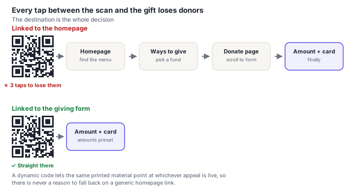
Three further rules that apply across every use case:
Code size is a function of how far away people will be standing, not of how much space the layout has spare. The working rule is printed width ≈ scanning distance ÷ 10, plus about 25% headroom.
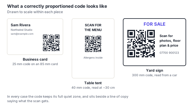
| Medium | Read from | Code size |
|---|---|---|
| Business card, product label | 20 cm | 2–2.5 cm |
| Table tent, menu, receipt | 30 cm | 3–4 cm |
| Flyer, printed program | 40 cm | 4–5 cm |
| Shelf edge, counter sign | 60 cm | 6–8 cm |
| Wall poster, church bulletin board | 1.5 m | 15–20 cm |
| Shop window, yard sign | 2–3 m | 20–30 cm |
| Trade show banner | 3 m | 30–40 cm |
Two layout rules that hold everywhere: keep the quiet zone (four blank modules on every side, which is part of the code and comes out of your layout budget) and keep the code clear of folds, trims and staples. Full detail in the sizing guide.
A bare QR code asks someone to take an action with no stated reward, and scan rates reflect that. The fix costs one line.
Be specific about the payoff. "Scan me" says nothing. "Scan for the menu," "Scan to check in," "Scan for photos and floor plan," "Scan to leave a review" all tell someone exactly what they're trading a few seconds for. Where there's a reason to hurry or a benefit attached, "Scan for 10% off today", say that instead.
Call-to-action text placed too close to the code eats the quiet zone, which is the most common cause of a scan failure that looks like nothing is wrong. Keep at least four modules of blank space between the code and any text or rule. When space is tight, shrink the code, never the margin.
A static code tells you nothing. You'll never know whether a poster produced 4 scans or 400, which makes it impossible to justify doing more of what worked.
A dynamic code routes each scan through a redirect, so you get counts, timing, device and rough location. That turns a printed campaign into something measurable. And, more usefully, lets you use a different code per placement so you can compare them.
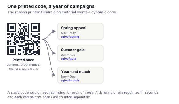
The reuse case is worth planning for from the start. Table signage, banners and printed programs tend to outlive the campaign they were made for, and a dynamic code lets the same physical material serve the next one.
The specific page that delivers what the code promised, with nothing in between. If the sign says "scan for the menu," it should open the menu itself. Not a homepage with a menu link in the navigation. Every intermediate tap loses people who are standing up with a phone in one hand. The destination also has to be mobile-first, since every single scan arrives on a phone.
Dynamic, for anything printed in more than trivial quantity. It's the only mechanism that lets you fix a wrong or dead destination without reprinting, and it's the only way to know how many people scanned. Static is the right choice for self-contained data that will never change: a Wi-Fi password by a guest room door, a vCard on your own card, an asset tag on equipment.
Roughly one tenth of the distance it'll be scanned from, plus about 25% headroom. A table tent read at 30 cm wants 3–4 cm; a yard sign read from a car wants 25–30 cm. Underneath that rule, never let individual modules fall below 0.4 mm in print. That's the real constraint, and it's why a code carrying a long URL needs to be physically larger than one carrying a short link.
Assuming it scans at all, it's usually one of three things. There's no copy saying what scanning gets you, so nobody has a reason. It's placed somewhere people aren't standing still. A code on a moving vehicle or above eye level in a corridor gets seen and not used. Or the payoff isn't worth the effort: "visit our website" is not a reason to take a phone out. If you're unsure whether it's a scanning problem or an interest problem, a dynamic code answers that in a day.
With a dynamic code, yes. That's one of its main advantages. The same printed banner or program can be repointed to whichever campaign is currently live, and each period's scans are counted separately. With a static code you cannot: its destination is fixed at creation, so each new campaign means new printed material.
Why a PDF menu is the wrong destination, table tent sizing and placement, handling allergens and price changes, and keeping the code working when the Wi-Fi doesn't.
Linking straight to the giving form, suggested amounts, one code per campaign, and the trust signals that stop a donor abandoning at the payment step.
How to find your review link, where to put the code so people actually use it, timing the ask, and what Google's policies do and don't allow you to offer.
vCard versus a landing page, why a full vCard often produces a code too dense to scan at card size, and where to place it without wrecking the design.
Unique codes per attendee, preventing duplicate entry, scanning offline when the venue Wi-Fi fails, and the difference between a ticket and a marketing code.
Giving, bulletins, event signup and prayer requests, plus the placement and pacing details specific to a service, and making it work for an older congregation.
Yard sign codes readable from a car, one code per property so you know which listing drove the call, and what to link to besides the portal listing.
Photo sharing, RSVPs, seating charts and playlists, the four that genuinely work, plus what to do about guests who won't scan anything.
What to put behind the code besides your homepage, where to place it on the pack, and how substrate and finish decide whether it scans under shop lighting.
Newsletters, permission slips, classroom resources and parents' evening booking, with the privacy and equity considerations that apply when the audience is children.
Maintenance tickets that already know which boiler, plus directories, access instructions and amenity booking. And what it takes for a code to survive years on a wall.
Print release stations, meeting-room help and asset runbooks. And the awkward truth that deploying them trains staff to scan unfamiliar codes.