Design & Best Practices
QR Code Design Best Practices
Most QR code design advice is either "don't style them at all" or "style them however you like, error correction handles it." Both are wrong. A code has specific structural requirements and a finite tolerance budget, and once you know where each one sits you can brand a code confidently without guessing. This is the complete checklist, from the rules that are absolute to the ones that are judgement calls.
The short version
- Absolute rules: keep the quiet zone, keep the finder patterns clear, keep dark modules on a light background.
- Budgeted: logo coverage (~15% of area), contrast (≥7:1), module styling. Each spends tolerance you may need elsewhere.
- Free wins: shorten the payload, size up, use vector export, use matte stock.
- A code that scans sometimes is a code that fails, treat marginal as broken.
- Design decisions compound: a styled, logo'd, colored code at minimum size has spent every budget at once.
The three absolute rules
These aren't trade-offs. Break one and the code stops working regardless of everything else you did right.
1. Never encroach on the quiet zone
Four blank modules on every side, minimum. It's part of the specification, and it's how a scanner establishes where the code ends and the surrounding world begins.
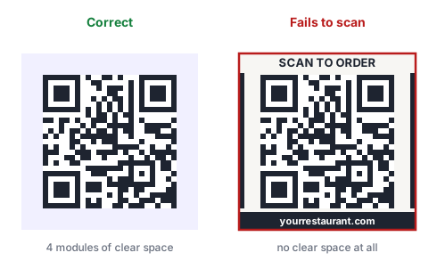
This is the rule design pressure breaks most often, because tightening a margin is the obvious move in a crowded layout. When space is tight, shrink the whole code rather than its quiet zone. A smaller code with a correct margin scans; a larger one without one may not.
2. Never let anything touch the finder patterns
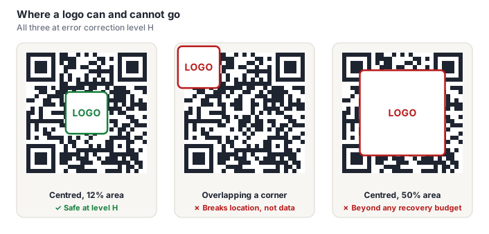
The three nested squares in the corners are how a scanner finds and orients the code, before it decodes anything and therefore before error correction is available to help. A logo, a fold, a staple or a design flourish over one of them causes a failure that no correction level can repair.
3. Keep dark modules on a light background
Scanners binarize the image before reading it, so the only thing that matters is a clear brightness gap in the conventional direction. Dark on light is what essentially every decoder is tuned for.
Inverted codes, light modules on a dark background, are valid per the specification and scan unreliably in practice. See the color guide for why contrast ratio alone doesn't catch this.
Contrast: the budget you spend first
Aim for a contrast ratio of 7:1 or better between modules and background. Black on white gives 21:1 and the widest possible margin.
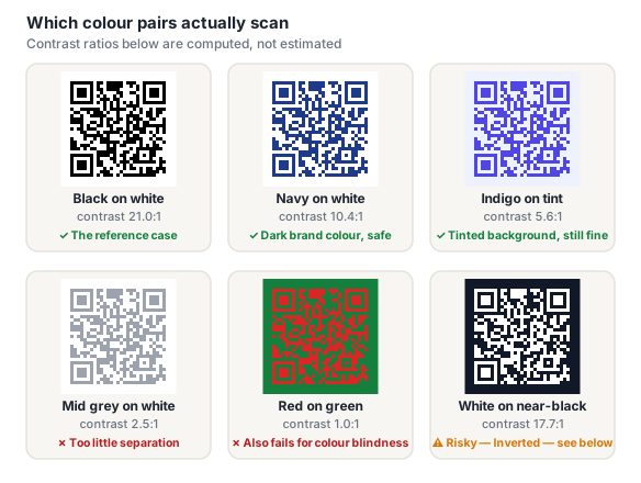
Dark brand colors on white work well. Mid-tones, pastels, and any pair with similar brightness do not, however different they look to you. And remember that print costs contrast you had on screen: CMYK conversion dulls vivid colors, and ink spread narrows the gap further.
Full color guidance, including gradients and brand palettes →
Logos: smaller than you've been told
A centered logo works, error correction reconstructs the covered modules. But the safe budget is meaningfully smaller than the 20–30% figure repeated across the web.
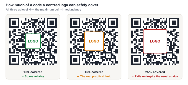
We measured the cliff at between 16% and 20% of the code's area at level H, under conditions kinder than any print job. Design for 15% or less: roughly 38% of the code's width. Always generate at level H, and add a blank padding ring so the logo's edges don't blend into surrounding modules.
Module and eye styling
Rounded modules, dot-style modules and custom finder-pattern "eyes" are the most common branding moves after color, and most modern scanners handle them without complaint. The grid positions haven't changed, only how each cell is drawn.
Where it goes wrong:
- Dots with large gaps reduce the effective dark area of each module. At small print sizes the scanner's sampling point can land in a gap rather than on the dot.
- Heavy rounding softens the boundary between adjacent dark modules, so a run of them reads as one blurred shape rather than a countable sequence.
- Custom eyes that reduce contrast or change proportions. Restyling the finder patterns is popular and it's the riskiest styling you can do. Their 1:1:3:1:1 run-length ratio is exactly what the scanner searches for. Keep them dark, keep the proportions, and change little more than corner radius.
- Stylization compounds with size. A styled code needs more physical size than a plain one, because every effect eats sampling margin.
A plain code and a heavily styled code with the same content are different artifacts with different tolerances. Verifying the plain version proves nothing about the one you're actually printing. Our shapes and logo help page covers the options in the generator.
Payload length: the free win
Shortening what you encode is the only reliability lever with no downside. Fewer characters means a lower version, which means fewer modules, which means every module is physically bigger at the same printed size.
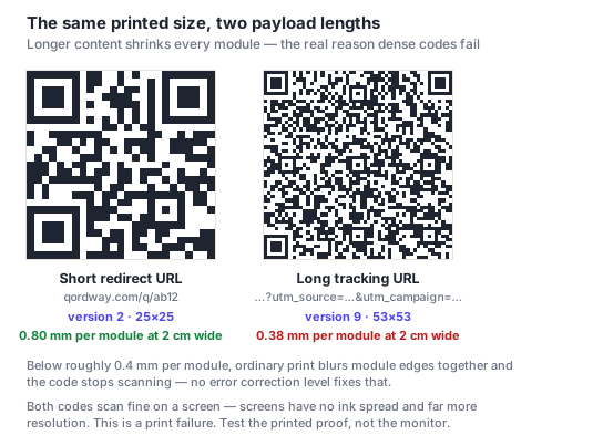
Practically: use a dynamic code for printed material so the encoded URL stays short regardless of how long the real destination is; drop unnecessary tracking parameters; and for URLs, consider uppercasing the host, which can keep the content inside the denser alphanumeric encoding mode.
When a code has to survive difficult conditions, work the levers in this order: shorten the payload, increase the physical size, then raise the error correction level. Most people reach for the last one first, and it's the weakest of the three.
Placement and context
- Put it where the scan will happen. A code below eye level on a wall, on the underside of a jar, or above a shop's awning is present and unusable.
- Never place a code over photography without a solid plate behind it. Two failure modes at once. No quiet zone, and a background that changes brightness under the modules.
- Keep folds, trims, perforations and staples clear of the code, especially the corners.
- Watch for glare. Gloss lamination and varnish can hide part of a code at the wrong angle. Ask for a matte spot varnish over the code area if the piece must be glossy.
- Don't crowd a retail barcode. Some scanning apps lock onto whichever symbol they see first.
Tell people what they'll get
This is a design decision, not a copywriting afterthought. A bare code asks people to take an action with no stated reward, and scan rates reflect that. A short label ("Scan for the menu", "Scan to check in", "Scan for 10% off") consistently outperforms a naked code. If it's not obvious what happens next, most people won't find out.
Budgets compound
Every rule above is individually survivable. The failure mode that catches experienced designers is spending several budgets simultaneously: a styled code, in brand colors at 6:1, with a logo at 18%, at the minimum size the layout allows, on uncoated stock. Each decision was defensible; together they leave no margin at all, and the code fails in the field while scanning fine on the desk it was designed on.
If you're going to spend one budget hard (a big logo, aggressive styling, a tight color pair) buy it back somewhere else. Size up, shorten the payload, or drop back to black on white. Then test it properly.
Frequently asked questions
Can I customize a QR code without breaking it?
Yes, within known limits. Color is safe if the modules stay dark on a light background at 7:1 contrast or better. A centered logo is safe up to about 15% of the code's area at error correction level H. Rounded or dot-style modules are generally fine. What you cannot do at any level of care is encroach on the four-module quiet zone, cover any part of the three corner finder patterns, or invert to light-on-dark and expect reliable scanning.
What is the most common QR code design mistake?
Losing the quiet zone. The blank four-module margin is part of the specification, and it's the first thing sacrificed when a layout gets crowded, often by placing text or artwork right up to the edge of the code. The grid itself looks perfect, so the cause isn't obvious when the code fails. The fix is to treat that margin as fixed and shrink the code instead when space is short.
Do rounded or dot-style QR codes scan properly?
Generally yes. The underlying grid is unchanged, only the rendering of each cell, and modern scanners cope well. Risk rises with aggressive stylization: small dots with wide gaps reduce the effective dark area, and heavy rounding blurs the boundary between adjacent modules. Both get worse at small print sizes. Style moderately, size up to compensate, and test the actual styled code rather than assuming a plain one's behavior transfers.
Should I add a call to action next to my QR code?
Yes. A bare code asks for an action without stating a reward, and scan rates suffer accordingly. A few words ("Scan for the menu", "Scan to check in") set expectations and measurably improve engagement. Keep the text outside the quiet zone, which is the one way this good idea commonly breaks the code it's attached to.
Is it safe to put a QR code over a photo?
Not directly. A photographic background fails twice: there's no quiet zone, and the brightness underneath the modules varies, so no single threshold separates dark from light across the whole code. The fix is a solid opaque plate behind the code, white or a very pale tint, sized to include the full four-module margin. Lightening the photo or using a semi-transparent panel doesn't reliably solve either problem.