QR Code Design Best Practices
The complete checklist: contrast, quiet zone, module styling, color, and the specific rules that keep a branded code functional rather than merely attractive.
Guide
A QR code can be perfectly valid and still fail constantly in the real world. Contrast that looks fine on a monitor, a logo sized by eye, a margin tightened to fit a layout, or a code scaled to the space available rather than the distance it'll be read from. Each produces a code that passes on a designer's desk and fails on a customer's phone. This guide covers the decisions that decide which of those you end up with.
A scanner doesn't see color. It converts the image to brightness and looks for a threshold that separates dark modules from light ones. That single fact explains most color-related failures: two colors can be obviously different to your eye and nearly identical in brightness, at which point the code simply isn't there as far as the camera is concerned.
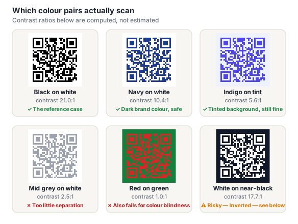
Practical rules that follow from this:
Light modules on a dark background can have excellent numerical contrast and still scan unreliably, because most scanner software is tuned to expect dark-on-light and some won't attempt the inverse at all. A contrast checker will happily pass an inverted pair, including ours, because contrast ratio is polarity-blind by definition. If you use one of our dark-background templates, test it on several real devices before committing to print.
The quiet zone is the blank margin around the code, at least four modules wide on every side. It is part of the specification, not a styling suggestion, and it is how a scanner works out where the code stops and the world begins.
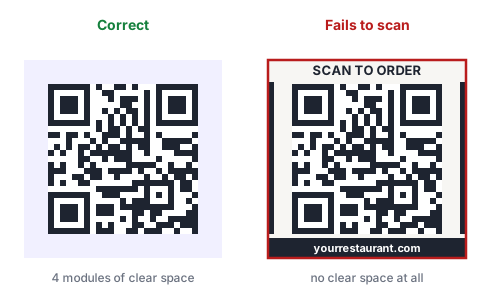
This is where design pressure does the most damage, because tightening a margin is the obvious move when a layout is crowded. It shouldn't be. When space is tight, shrink the whole code rather than its quiet zone: a smaller code with a correct margin scans; a larger one without a margin may not scan at all.
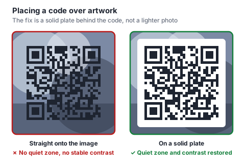
Putting a code straight onto an image fails twice over: there's no quiet zone, and there's no consistent brightness threshold, because the background changes underneath the modules.
A logo in the center of a code works, and it's the single most requested piece of QR branding. Error correction is what makes it possible. The covered modules are treated as damage and reconstructed. But the budget is much smaller than the internet says.
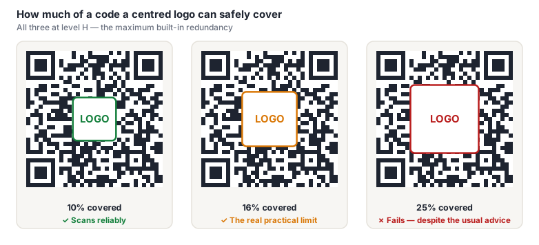
We swept coverage levels against a real scanner across several code versions at level H. The cliff sits between 16% and 20% of the code's area. And that's with a clean digital render and a perfect quiet zone, conditions kinder than any print run. Plan for 15% or less.
Placement matters as much as size:
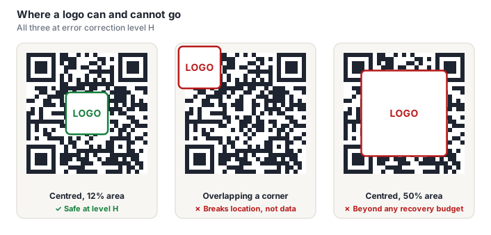
The middle case is worth dwelling on. That logo covers only 12% of the code, well inside the safe budget, and the code is unreadable, because it sits on a finder pattern. The scanner uses those three corners to locate and orient the code before error correction is available, so damage there isn't damage the correction budget can spend against. It's structural.
When a code won't scan reliably, the instinct is to raise the error correction level. That's usually the wrong move. It adds modules, and at a fixed printed size more modules means every module gets smaller. The lever that actually helps is shortening what you encode.
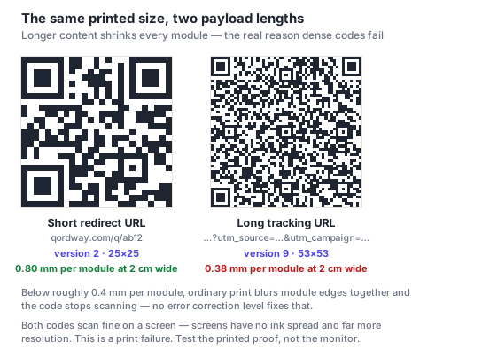
This is the strongest practical argument for dynamic codes on printed material: the code encodes a short redirect regardless of how long the real destination and its tracking parameters are, so the grid stays sparse and every module stays large.
When a code has to survive difficult conditions, work the levers in this order: shorten the payload, then increase the physical size, then raise the correction level. That ordering reflects how much reliability each one actually buys.
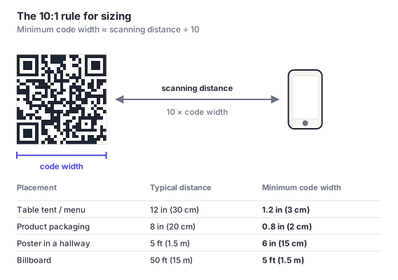
Code size is a function of scanning distance, not of how much room the layout has. The working rule is one tenth: minimum printed width ≈ scanning distance ÷ 10.
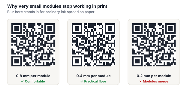
Underneath that rule is the real constraint: the size of one module. Keep modules at 0.4 mm or larger in print. Below that, ordinary ink spread starts merging adjacent modules into each other, and no amount of source-file quality prevents it.
Almost every "this code just won't scan" complaint lands in one of a small set of causes. Ranked roughly by how often they're the culprit:
| Cause | Why it happens | Fix |
|---|---|---|
| No quiet zone | Margin tightened to fit a layout | Four modules minimum; shrink the code instead |
| Low contrast | Brand color chosen by eye, not brightness | Dark modules on a light background, ≥7:1 |
| Too small for the distance | Sized to available space | Distance ÷ 10 |
| Payload too long | Full tracking URL encoded directly | Short link or a dynamic code |
| Logo too large or misplaced | Following the common 20–30% advice | ≤15% of area, never on a corner |
| Placed over imagery | Design preference | Solid plate behind the code |
| Glare | Gloss lamination or a screen | Matte stock; raise screen brightness |
| Inverted polarity | Light-on-dark styling | Test widely, or don't |
Technically yes, color has no effect on the encoded data. Practically, the dark modules need to stay genuinely dark and the background genuinely light, because a scanner works from brightness rather than hue. Dark brand colors on white are fine; mid-tones, pastels and light-on-dark are where problems start. Two colors can look completely distinct and still have nearly identical brightness, which makes the code invisible to a camera.
About 15% of its area at error correction level H, meaningfully less than the 20–30% most guides quote. We tested this by decoding a sweep of coverage levels with a real barcode detector across several code versions, and codes started failing between 16% and 20% under conditions better than any print job. Because this is area rather than width, 15% of area is roughly 38% of the code's width. The logo must also never touch the three corner finder patterns, regardless of size.
That's the signature of a code sitting right at a limit rather than comfortably inside one: usually a logo slightly too big, contrast slightly too low, or a size slightly too small. Cameras, decoding libraries and lighting vary enough that a marginal code passes on the device you happen to test with and fails elsewhere. Treat inconsistent scanning as a failure, not a partial success, and test across several devices before printing.
Not on their own. The grid positions haven't changed, only how each module is drawn, and modern scanners handle styled modules well. Risk comes from aggressive stylization: very small dots with large gaps reduce the effective dark area, and heavy rounding softens the boundary between adjacent modules. Both get worse at small print sizes. Style moderately, and test the actual styled code rather than assuming a plain one's behavior carries over.
Only if something is covering the code. Otherwise a higher level adds modules, and at a fixed printed size that makes every module smaller. Which is itself a scanning risk. For a clean code with nothing on top of it, level M gives plenty of real-world tolerance while keeping modules comfortably large. Defaulting everything to H is a common habit that can make codes slightly worse.
The complete checklist: contrast, quiet zone, module styling, color, and the specific rules that keep a branded code functional rather than merely attractive.
Which color pairs work, why contrast ratio alone isn't sufficient, what makes inverted codes risky even at high contrast, and how to use a brand palette without breaking scannability.
The real coverage budget measured against a scanner, why finder patterns are off limits at any size, the padding ring that buys you margin, and how to brand a code without breaking it.
Every failure mode in detail, what each one looks like from the scanner's side, and how to tell which one you're actually hitting.
Concrete sizing targets by medium and distance, minimum module sizes, DPI and export-format guidance for print, and the different constraints that apply on screen.
The pre-press checklist: what to test, on which devices, under what lighting, and why a proof on the actual stock catches failures a screen test never will.
The physical side: substrates, curvature and how scanners correct for it, print processes from flexo to thermal, and the material choices that decide whether a code survives its own packaging.