Customizing your QR code
Finding Your Way Around the Panel
The generator's options are grouped into four sections you can open and close. If you used the site before and something looks missing, this page says where it went.
The short version
- The type buttons and the fields for that type are always visible. Nothing folds them away.
- Everything else lives in Colors, Shape & style, Logo and Advanced.
- Colors is open to begin with; the rest start closed and open when you select their heading.
- Whatever you leave open is remembered on that device, so the panel comes back the way you had it.
- Every control has a small ? beside it that explains what it changes.
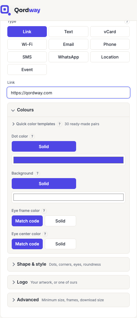
What is in each section
| Section | What it holds |
|---|---|
| Colors | Quick color templates, Dot color, Background, and the two eye colors. More on colors. |
| Shape & style | Dot style, Corner style, Eye center shape, the overall square-or-circle Shape, and Background roundness. More on shapes. |
| Logo | Turning a logo on, choosing it, and its size and clear space. More on logos. |
| Advanced | Minimum size, frames and frame text, and the download size. More on minimum size. |
Closed sections still say what they hold, in gray beside the heading, so you can find something without opening each one in turn.
Why the options are grouped at all
They were not, until now. Every option sat in one list, and that list had grown to roughly twice the height of a laptop screen. Which made it hard to find anything and easy to miss half the features entirely.
Grouping them does not remove or gate anything. Every control that was there before is still there, in the section its name suggests, and nothing has moved behind a paywall.
One control did move for a reason worth knowing: Eye center shape used to sit between the two eye color controls, where it looked like a color setting. It is a shape, and it is now with the other shapes.
The strip under the code
Directly beneath the preview there is a single line that says whether anything about the current design might affect scanning. It is always there, in one of four states, and it never changes size, so the code above it never moves while you are looking at it.
- No scan issues found. Nothing we check was flagged.
- One thing could affect scanning. A single issue, such as colors that are close in tone.
- Several things could affect scanning. Two or more at once. Worth reconsidering unless the look matters more to you than the scan, because these compound: a large logo and weak contrast both eat into the same error-correction budget, so together they are worse than either alone.
- Too long to encode. There is no code to judge yet. Shorten the content.
The calm state is not a promise that the code will scan. It means the three things we can measure came back clean: the length of your content, the contrast between the code and its background, and how much of the pattern a logo covers. It cannot tell you about the quiet zone in your layout, how small you are printing, what you are printing on, the light in the room, or the camera in someone's pocket. Print one and scan it before you print five hundred. How to test a code properly.
When something is flagged, a Show me button appears beside the message. It opens the section responsible and scrolls to the full explanation, which is useful because most sections start closed.
Where the warnings appear
Each detailed warning sits with the control that causes it, rather than collected at the foot of the panel. So the explanation is next to the thing you would change to fix it.
| Warning | Where it appears |
|---|---|
| Content too long to encode | Under the content fields, at the top. Never inside a closed section, because a code that cannot be built is not something you should have to go looking for. |
| Colors too close in tone | Colors, under the background picker |
| No background, so no contrast check | Colors, in the same place. It replaces the contrast reading rather than joining it, because with no background there is nothing to measure against. |
| Logo coverage or density | Logo, under the size slider |
They used to sit together at the bottom of the options column, which meant a warning about a logo could be a full screen away from the logo slider, and further still from the code it described.
The ? beside each control
Select the small ? next to any label and a short explanation appears. It says what the control changes and the one thing worth knowing about it. That a logo is deliberate damage to the pattern, that minimum size is a floor rather than a fixed size, that background roundness never touches the code itself.
The phone apps show the same explanations behind the same ?, so a control means the same thing wherever you meet it. Anything that needs more than a sentence is a page in this help section, linked from the relevant page here.
Frequently asked questions
A control I used to use has disappeared.
It is in one of the four sections, check the table above for which. Nothing was removed. If the section is closed, its heading still names what is inside.
Can I have everything open at once?
Yes. Open all four and they stay open, on that device, until you close them again. The panel is long that way, which is why it does not start like that.
Does the site remember this across my devices?
No. It is stored in your browser, so your laptop and your phone can be set up differently. Which is usually what you want, since a phone has far less room. Signing in does not change it either way; it is not account data.
What if my browser blocks site data?
The sections still open and close normally; the panel simply starts from its defaults each visit.