Customizing your QR code
Colors, Gradients & Quick Templates
Every QR code type can be recolored, pick a ready-made template, or set the dot and background colors yourself.
Quick color templates
In the Colors section, select Quick color templates to open it. A Light backgrounds row of small circular swatches shows 20 ready-made color pairings (like "Indigo Classic" or "Deep Ocean"); select one to set the Dot color and Background instantly.
It sits above those two fields and starts closed, because thirty swatches and their guidance would otherwise push the color pickers themselves off the screen. How the panel is organized.
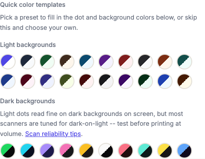
Available to every tier, including logged-out visitors. It's not a paid feature. Every pairing has been checked for enough contrast to scan, so the templates are the safe path if you don't want to think about it.
Dark background templates
Below the light row, a second Dark backgrounds group offers 10 presets with a light dot on a dark background (like "Neon Pulse" or "Cyber Cyan"). The style apps such as Spotify use for their own codes.
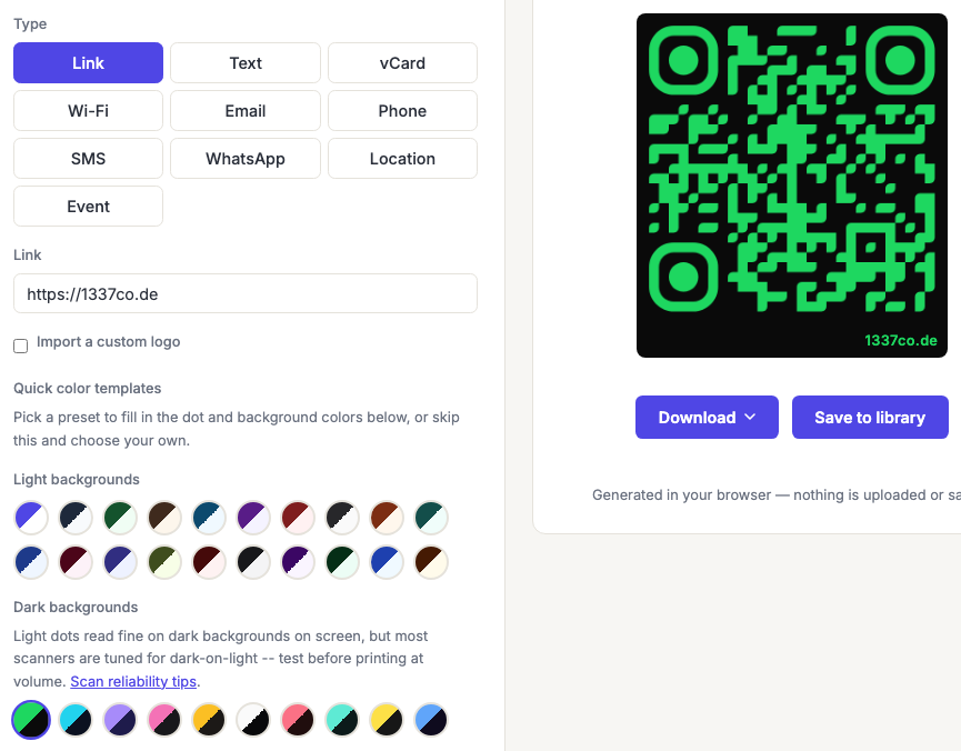
These read fine on screen and are riskier in print. The reason isn't contrast. It's that scanner software has historically assumed dark modules on a light background, and some decoders still don't try the inverted interpretation. A code with excellent numeric contrast can still scan worse simply because it's the wrong way round.
So use them where you control the medium and can test: a screen, an app, a single poster. Think twice before a large print run, and always test a physical proof first. See scan reliability tips.
Setting your own colors
Use the Dot color and Background color pickers to choose any solid color.
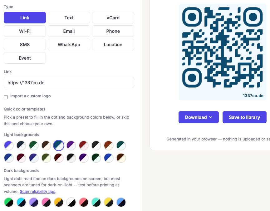
The generator warns you when the two colors are too close in tone to scan reliably. That warning is a floor, not a target. It fires only when the pairing is genuinely marginal, so a code that clears it is not necessarily a good idea. Aim for a strong difference in lightness, not just in hue.
That distinction is the one that catches people out. Red on green looks violently different to a human eye and can be nearly identical in brightness. Which is all a scanner sees, because it converts the image to grayscale before decoding. Squint at your code: if the two colors merge, so will they for the scanner.
Color rules worth following
- Dark modules on a light background is the combination every scanner handles.
- Aim for a contrast ratio of at least 7:1. Comfortably more than the minimum, which leaves room for print and lighting to eat into it.
- Keep the background genuinely light. A mid-tone background is where most marginal codes come from.
- Never place a code straight onto a photo. Put it on a solid plate, see common scanning failures.
- Test in print, not on screen. Screens are backlit and forgiving; paper and ink are neither.
The full reasoning, with measured contrast ratios, is in QR code colors.
Gradients
Advanced and Business plans can switch either the Dot color or the Background from Solid to Gradient, picking two colors and a linear or radial direction. Basic and logged-out visitors see only the Solid option.
Gradients are the easiest way to make a code fail without noticing, because the contrast check can only look at the overall pairing while the actual risk is local: a gradient that starts dark and ends light will be perfectly readable at one end of the code and marginal at the other. Keep both stops within the same tonal range, two shades of the same dark color rather than dark-to-pale.
Frequently asked questions
Can I use my brand colors?
Usually yes, with one condition: the dot color needs to be clearly darker than the background. If your brand color is light, use it as the background with near-black modules rather than the other way round. That keeps the brand present and the code reliable.
Why does my code scan on my phone but not on others?
Marginal contrast is the most common reason. Your phone's camera, in your lighting, at your distance, is one data point. And a code that's borderline will pass for some cameras and fail for others. If you saw the contrast warning at all, treat that as the answer. See why codes fail.
Are inverted (light-on-dark) codes actually broken?
Not broken, less reliable. Many modern scanners handle them fine, and some don't try the inverted reading at all. For a screen or a controlled setting they're a reasonable style choice; for something printed at volume and scanned by strangers on unknown devices, the safe choice is dark-on-light.
Do gradients affect scanning?
They can, and more than people expect. Keep both colors in the same tonal range so the contrast holds across the whole code, and always test. The risk is that one region of the code is fine while another is marginal.
Can I set a transparent background?
Yes. In the Colors section, set Background to Transparent and the code exports with nothing behind it. The preview switches to a checkerboard so you can see that there is no background, rather than a white one.
PNG, SVG, PDF, EPS and GIF all carry it. JPG cannot: the format has no transparency at all, so a JPG download flattens to white rather than producing something unexpected.
The trade is real and worth knowing: a transparent code takes on whatever ends up behind it, and if that turns out to be dark or busy it will stop scanning. Because there is no background, we cannot check the contrast for you either. The reading is replaced by a reminder to place it on a light, solid area. Why codes fail to scan.